For this project I Immediately knew I wanted to create the “Smopper App” (Smopper being a mix of the words smart + shopper). I wanted the app the solve the problem of not knowing what grocery store to go to, to get an item for the lowest price. This is something I personally have found very frustrating and would like a solution for.
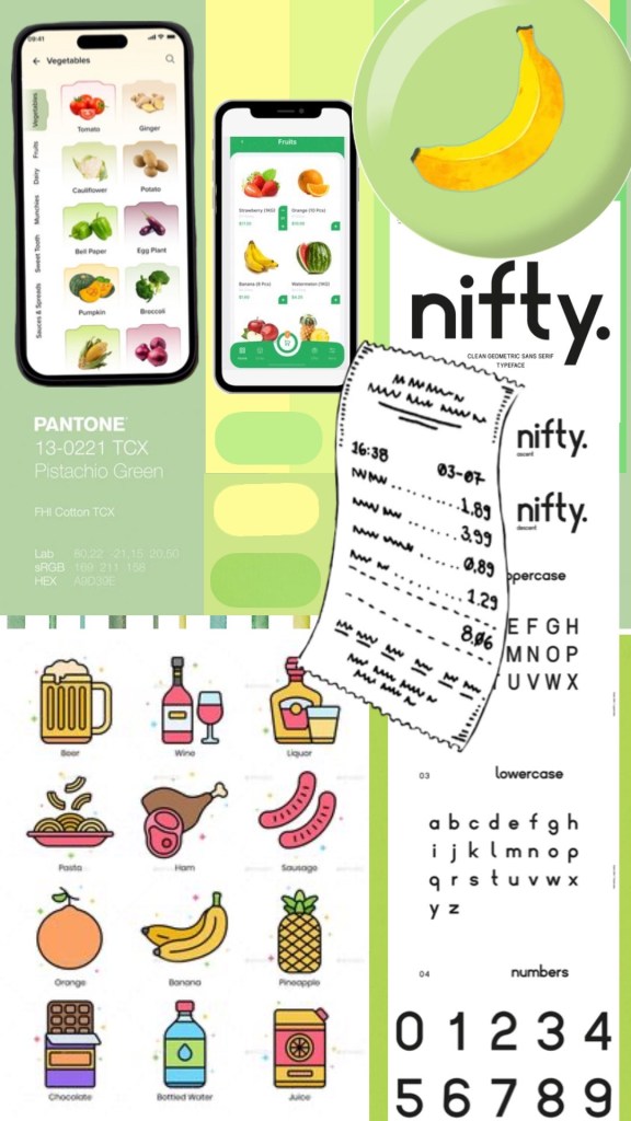
When creating the mood board I knew I wanted to center the design around the a clean light green pistachio colour – which to me invokes a feeling of minimalism and fresh groceries. I also include a banana icon/logo because of its nice contrast with the pistachio green and connotation of being one of the most affordable and recognizable grocery items.
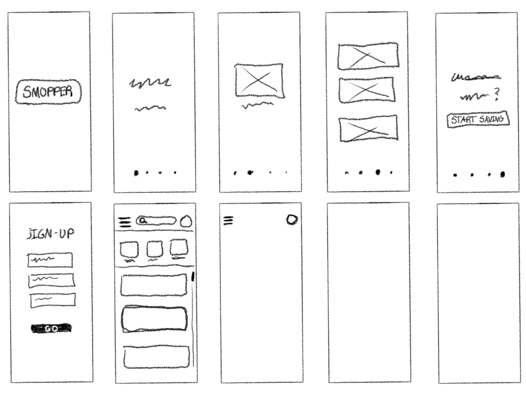
My first wireframe was done digitally and consisted of an illustrated tutorial/introduction where the user could get a sense of what smopper does and is all about. This is something I was inspired to do from the “Forest” app – a pomodoro timer app that helps you stay off your phone and accomplish tasks. They start off with a short illustrated tutorial which I really enjoyed beacuse it made me feel like I was eased into the app’s user experience rather than being thrown straight into the deep end like you are with others.

My final design when built out in figma stayed mostly the same but a few things did change. I forgot to account for the header space used in most apps on the iPhone 15 pro, so I added in a simple green header with the logo that I feel added a sense of professionalism and believability to my design.
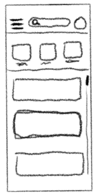
The other thing that changed was my original idea to add scrollable ‘boxes’ under the search bar that included things like: favorites, offers, coupons.,etc. Instead I decided to include it in the hamburger menu/sidebar overlay to keep the main page simple with only the stores list and search bar.
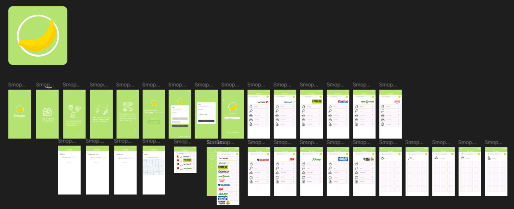
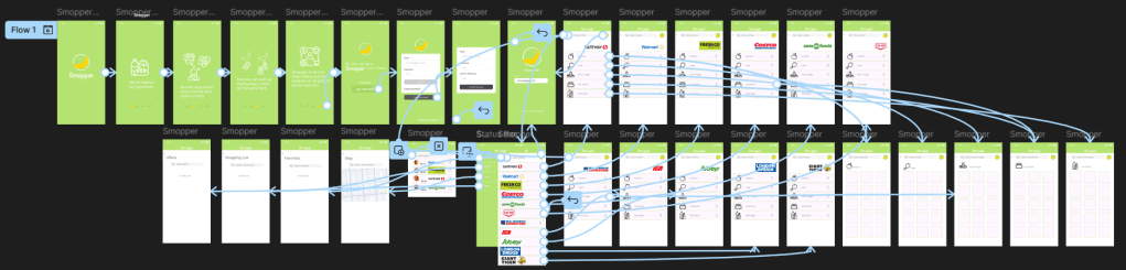
Figuring out figma was definitely a bit of a learning curve, but once I watched a few tutorials and did some one my own ui/ux research it became much easier. Once I figured out the sliding tutorial pages and flow I moved on to creating the account sign up/log in pages which were fairly straightforward thanks to the assets already available in figma. Next was the list of stores which I decided would function as the homepage. I’m not sure if there was a faster way to do it but I had to tediously connect each store to its own page and then connect each category within the stores page to it’s own page (which was very painful). Lastly I taught myself how to create a side bar overlay and linked the categories within to their own pages.
Overall I am quite happy with the design and, with a few tweaks, could definitely see it being a real app used by many. Perhaps one day it might be 🙂

Leave a comment