When I first decided to redesign Wander YHX’s logo, I knew I wanted to build on my original design, but also inject new life into it by adding more professionalism to the brand and choosing some statement colours for variety and fun. Medicine Hat is a vibrant and beautiful sunny city with so much character, and I wanted the logo to reflect that energy in a meaningful way.
I also wanted it to reflect my personality more, and the values of my brand. Focusing on positive, uplifting, inspiring explorative imagery.
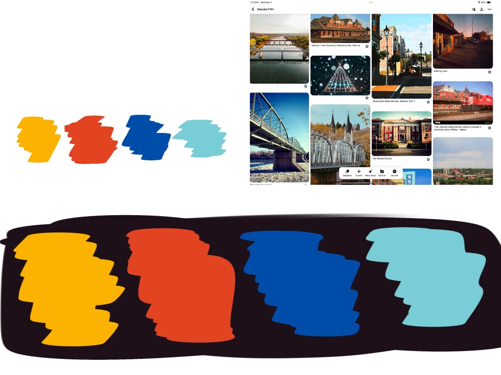
Choosing Colour
I began the re-design process by looking up images of Medicine Hat and saving the ones that I thought best encapsulated the city. Then I eyeballed the 4 main colours that appeared the most and represented aspects of Medicine Hat (the deep blue of the sky, the red orange of the brick buildings, the light teal of Finlay Bridge, and the gold yellow of the grass.) and used these as the basis for the palette.

picking out and eyeballing the main colours
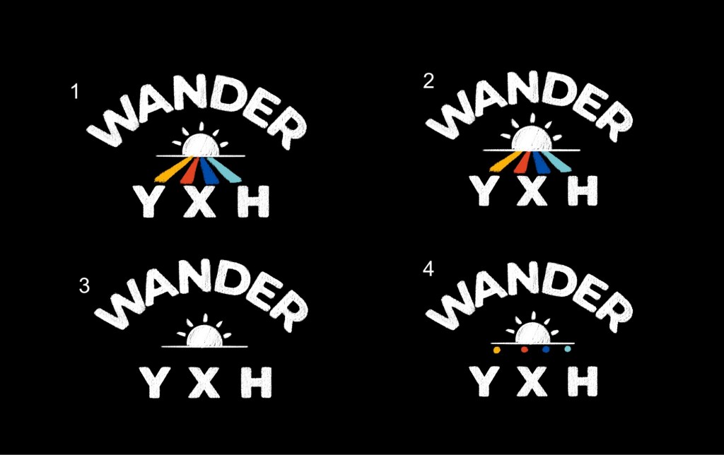
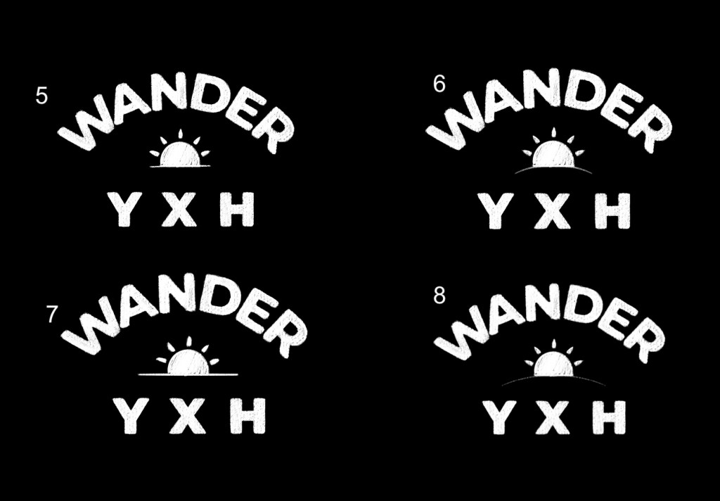
testing how colours look on a black and white background
Logo Design
Once I had decided on the colour palette I began working on the logo itself. My original logo was hand drawn and made intuitively without using a grid or font as a guide. So this time I wanted to begin with a more structured approach.

Original Wander YXH logo
The main issues I wanted to fix were
- Uneven letter sizing
- To close letter spacing
- W looked weird
- Frown imagery in the sun icon
Though I wanted to maintain the integrity of my original design I also didn’t want to prevent myself from exploring alternate logo designs. So I experimented with different layouts and use of colour but ultimately decided on the original rainbow design.
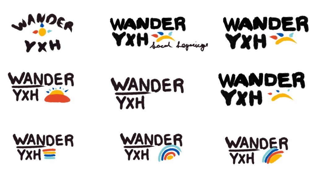
For the font I chose Montserrat ExtraBold. It is clean, bold, and timeless. All qualities that I felt aligned well with Wander YHX’s mission. However looking at the initial drafts I found it felt too polished and sterile. Which I felt didn’t represent Medicine Hat’s rich history and character.
To fix this I used the font as a guide and redrew the letters with an organic brush, adding texture and irregularities to give the design a hand drawn/stamped feel. This subtle imperfection brought warmth and personality to the logo, making it feel more approachable and authentic.
A Million Variations
Throughout the design process I went through many different versions of the logo slightly tweaking different elements – some with colour some without – longer lines vs short..etc,.
My favorites were versions number 1, 5, 8 and 10. But I ultimately decided on number 1
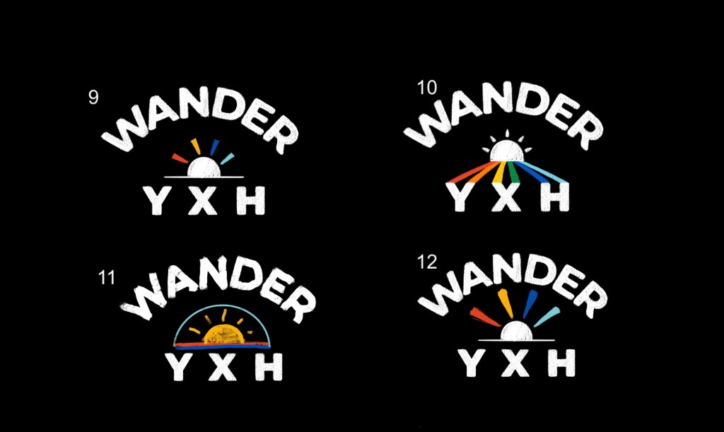
Colour logo variations

Leave a comment